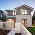
When it comes to choosing colours for your new build, the options are endless. You could opt for a cool, calm colour palette with soft blues and greens featured throughout; or a design with more impact that incorporates bold feature walls to match striking art pieces. Perhaps it’s texture that inspires you and stone paint in neutral colours is what you’ve been searching for…
At RODA, we know that each project is as unique as each client. That’s why we launched the Style Studio – to give our clients the opportunity to come into RODA HQ and select the benchtops, cabinetry, tiles, bricks, fittings and colours that will make up their bespoke design.
 With so many options at the Style Studio you could probably spend days in here, but to save you some time we have a dedicated colour consultant, Steph, who can guide you through each decision and talk about how the design will come together.
Steph undertakes regular market research and training to stay informed of new trends, styles and colours in the industry. You can rely on her to know what colour palettes and property styling is trending for both new homes and investment properties.
For those of you who aren’t ready to visit the studio but want to learn more, we thought we’d sit down and chat more about the importance of colour with Steph. Keep reading to find out what she had to say…
Create a Mood
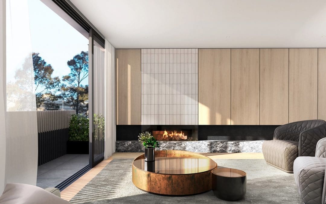
Colour can be a great way to create a mood. If you’re looking to create a calming or relaxed feeling, we recommend soft neutral colours like greys, earthy greens and browns and pastel blues. For an inspirational and creative space like a home office, study or kitchen, you could opt for more striking colours like blue and yellow, both of which can aid concentration, encourage positivity and soothe the mind.
In the bedroom, cool tones are a winner, with white, light grey, soft blues and greens all promoting rest and restoration. Of course, while it’s important to choose the right colour for each space, it’s equally important to ensure your overall design ties together to create seamless transitions between each room of the home.
Steph Says
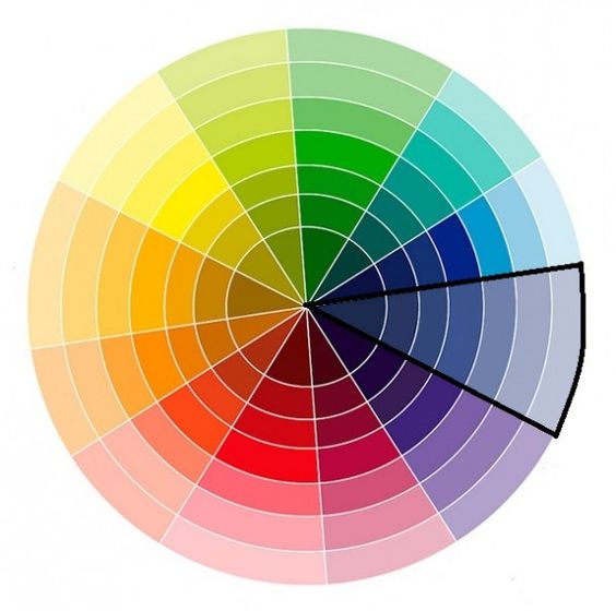
“Colour is a great way to spark emotion and can be used to encourage positivity, inspiration, relaxation and calm in different rooms of the home. If you’re looking to pair colours for a unique design, look across the colour wheel – for example, blue and yellow can be a great combo.”
Light vs Dark
When choosing a style for your home, a good place to start can be considering a light versus dark colour palette. While white on white with pops of colour is a common stylish home design, it’s not your only option. For a grand, elegant and modern-industrial look, dark colours are a great option.
Whether it’s darker cabinetry, an eye-catching feature wall, or inky furnishings, a darker colour palette can lead to a striking design. Historically, darker spaces have been associated with cramped or depressing rooms, but the reality is quite the opposite. A dark colour palette can add a feeling of cosiness and with the right amount of natural light can bring an elegance that’s hard to recreate with light colours.
Conversely, light colours are a great choice, particularly if you’re looking for a minimalist, clean or Hamptons look. White walls, timber flooring, coloured cabinetry and marbled benchtops can bring a unique sense of style to your custom home.
Steph Says
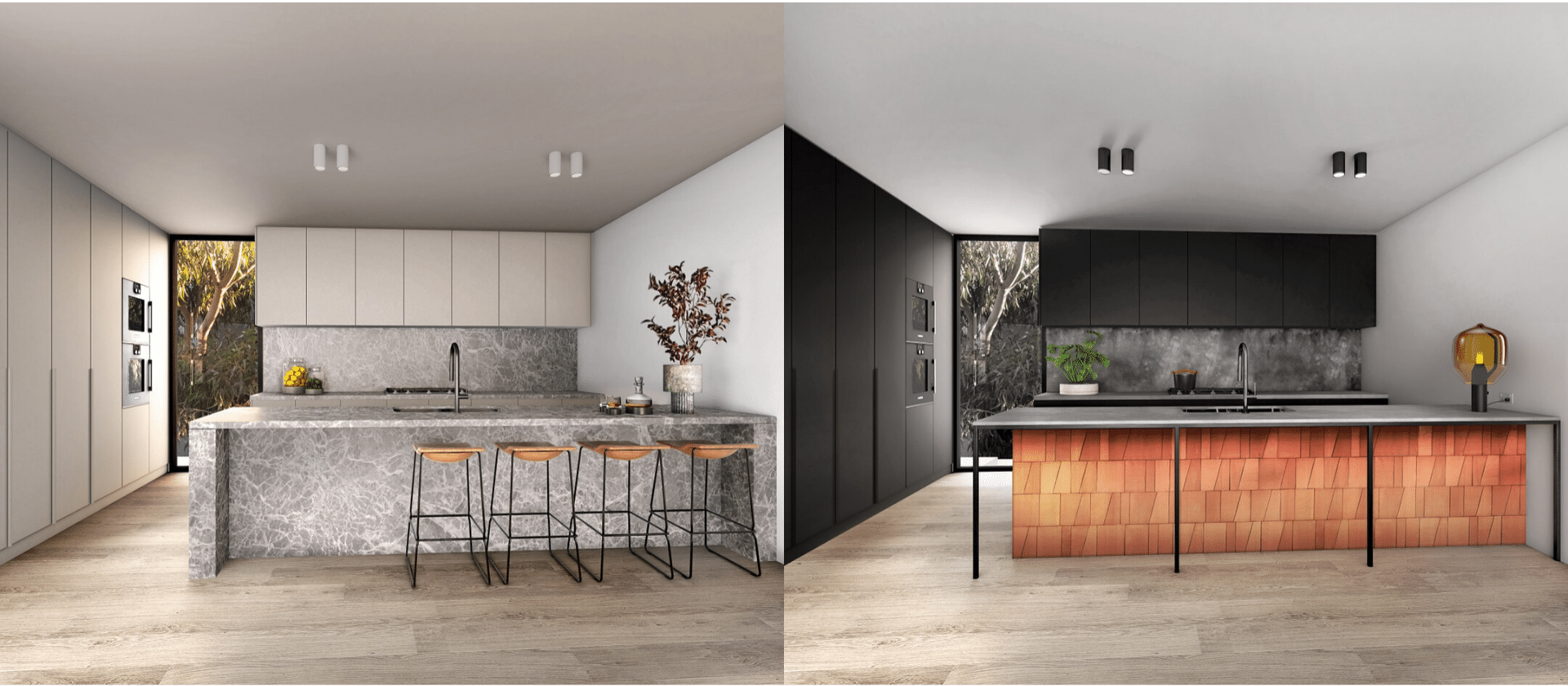
“Choosing a light or dark colour palette is a great start for your home. We can work backwards from here once you’ve made this decision. Below are two iterations of the kitchen design at our North Melbourne townhouse project. As you can see the darker design evokes feelings of elegance and sophistication, while the lighter design feels more open and allows the benchtop to shine.”
_________
Find out more about our Style Studio or make an appointment with Steph here. If you’re ready to get started on the custom home design of your dreams, get in touch with the team at RODA today!


")